Google Quietly Refreshes Its Iconic ‘G’ Logo After Nearly a Decade

Google updated its ‘G’ logo with a modern gradient look, its first redesign in nearly ten years. The update will start on iOS and Pixel.
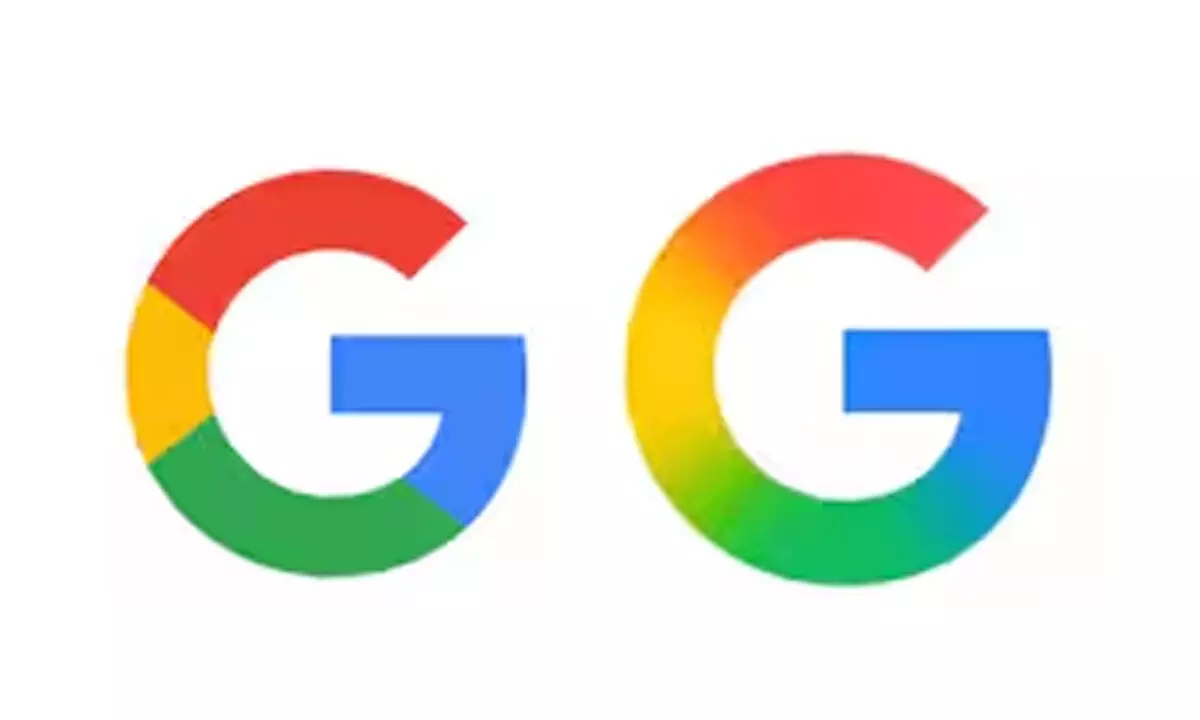
In a subtle yet symbolic change, Google has refreshed its iconic ‘G’ logo for the first time since 2015. The update was first spotted in the latest version of the Google app on iOS and Pixel devices, featuring a new gradient design that merges the brand’s signature red, yellow, green, and blue colours.
Unlike the previous version, which had clearly defined colour blocks, the new design presents a smoother, blended appearance, aligning more closely with Google’s evolving design language, especially the Gemini logo.
This marks Google’s first major logo update since its September 2015 shift to a sans-serif font and multicoloured “G.” While the change is currently limited to select platforms, it signals the beginning of a broader visual refresh across Google’s ecosystem.
As of now, the updated ‘G’ logo hasn’t rolled out to Android devices or the web, where the older version still remains.


