How graphic designs can help save lives

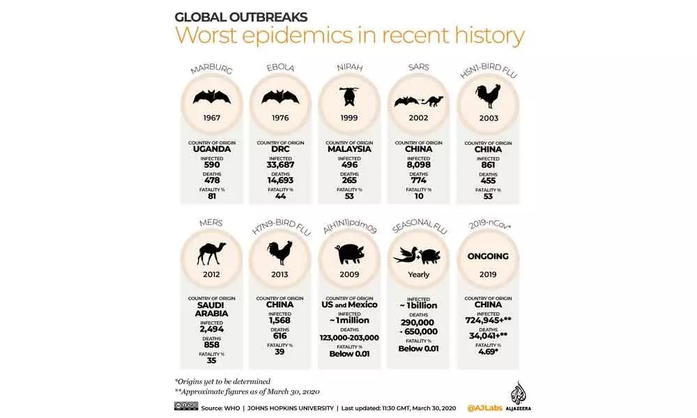
Sydney: As graphic artists the world over churn out infographics for various research papers and studies on the new coronavirus pandemic, new research reveals that they have a bigger role to play in making right information and precautionary measures more accessible to the people.
The infographic that has become the defining graphic for the COVID-19 pandemic, with its own hashtag, is the "Flatten the Curve" graph.
Its earliest-known use is in a 2007 paper published by the US Center for Disease Control, previewing responses to a pandemic like COVID-19.
According to Dr Rebecca Green, Art and Design Lecturer at University of New South Wales (UNSW), the graphic designers have an utmost challenge to give correct information in a time of crisis, with the COVID-19 situation changing by the minute across the globe.
"We are far more fluent in infographics today, although our understanding and trust in the data presented is often at much lower levels. We often judge the authority behind the infographic — and how trustworthy the data is — based on what the infographic looks like," Dr Green said in university statement.
If you Google COVID-19, there are already more than five million references, and more than two billion references of #coronavirus in the media.
There are conspiracy theories, advice from different levels of government, conflicting medical advice, and opinions flooding in through traditional and social media.
"In the fight to contain the virus, graphic design might seem an unexpected weapon. But graphic design has a long history of helping identify, fight and stop the spread of disease, dating back as far as 1854 when another epidemiological disaster threatened the population — the London cholera outbreak," explained Dr Green.
"How do we find the truth when the misinformation and miscommunication — however well intentioned — is spreading faster than the virus itself?" she asked.
According to her, we can use the techniques of rhetoric to isolate reasons it works.
"First, it has been used by many authorities and commentators around the world as their driving message, so rhetorical 'repetition' helps us remember it. Studies have shown that when we can remember something easily, we are likely to trust it more," said Dr Green.
Secondly, when we can attach an infographic to people we trust (whoever that might be for each of us) then it develops its own authority.
"This is called Ethos, where the speaker's own credibility in turn enhances the credibility of the message," she stressed.
And thirdly, the graphic has been translated and reinterpreted so many times, but the simple key elements of the graph remain the same. The different curves always show that same, clear message.
"This rhetorical approach has important implications for how our authorities deliver concepts to us. Repeating a message that is easy to understand, and attaching it to authority figures we trust might be a good start," Dr Green noted.


